- They have too many ads, or other clutter on the page, making it hard to find the things you are looking for.
- Often have the recipe ingredients far away from the steps, so you have to constantly scroll back and forth.
- It’s hard to specifically search for a wide array of recipes if you have a particular food allergy.
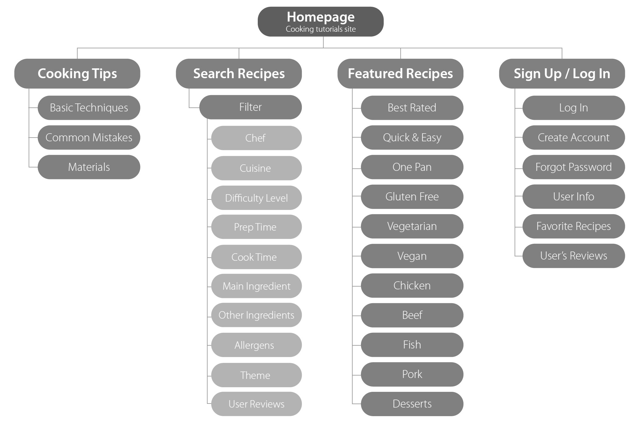
Site Map
In the wireframe, the robust search is I began the thought process for the app by creating a site map, highlighting that the site would be heavily search-based, with an array of categories the user can filter by.
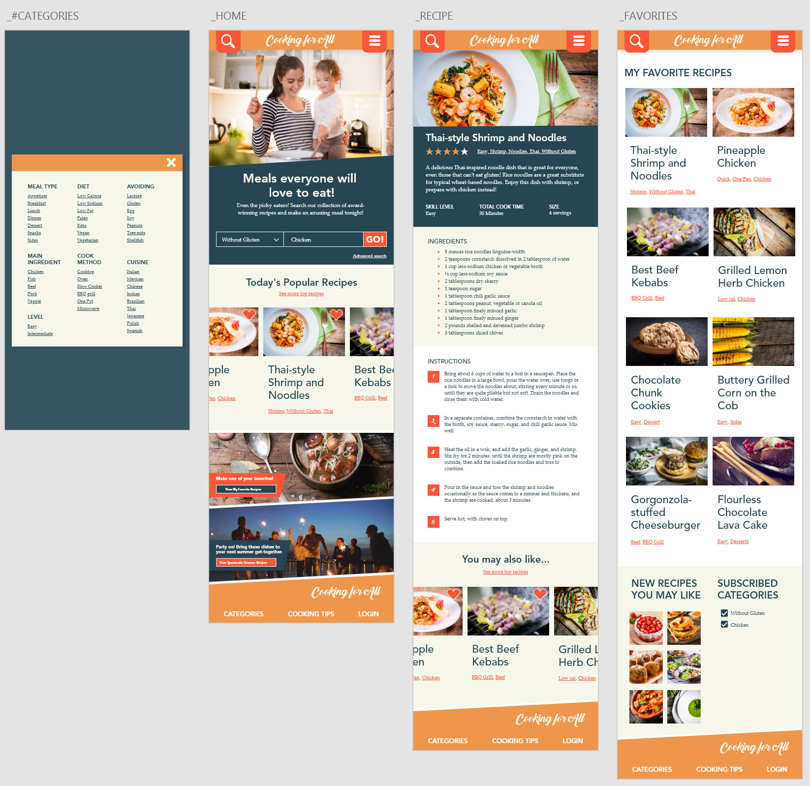
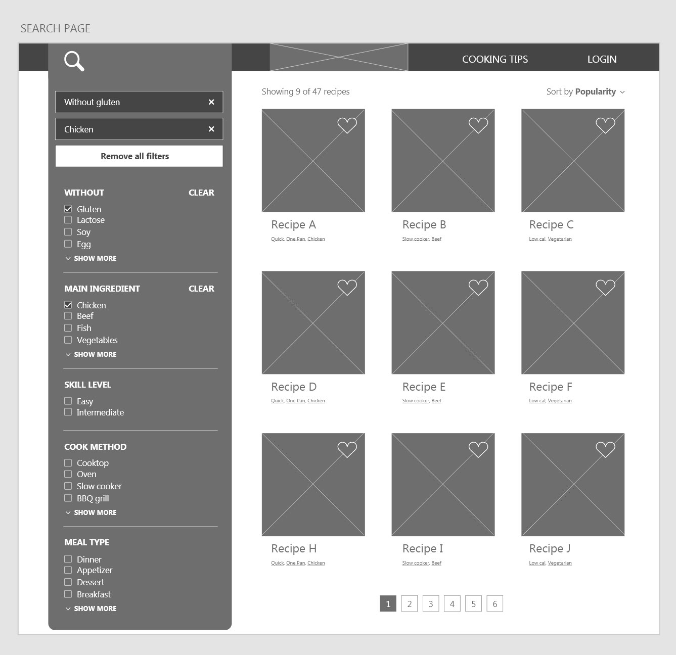
Digital Wireframes: Desktop
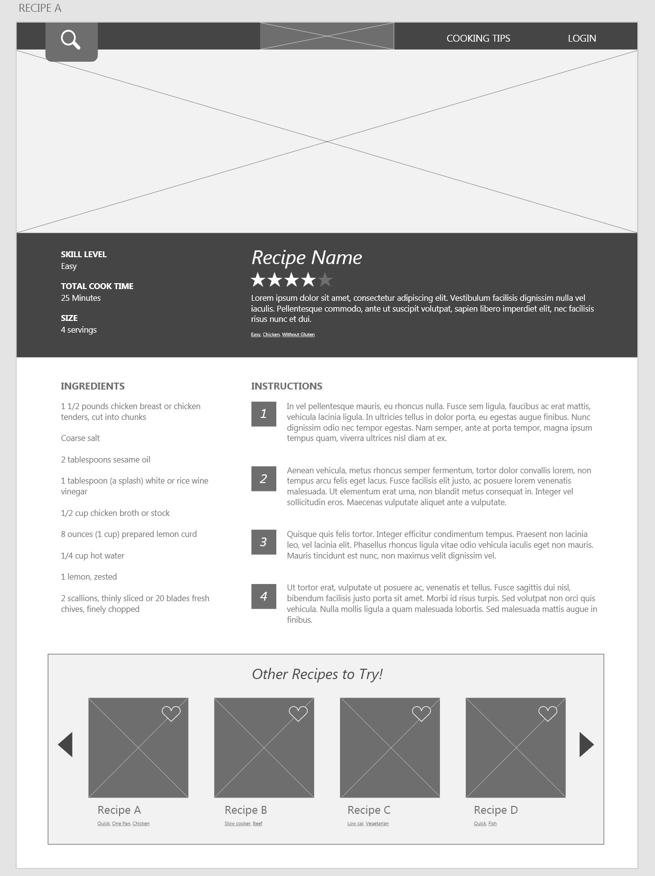
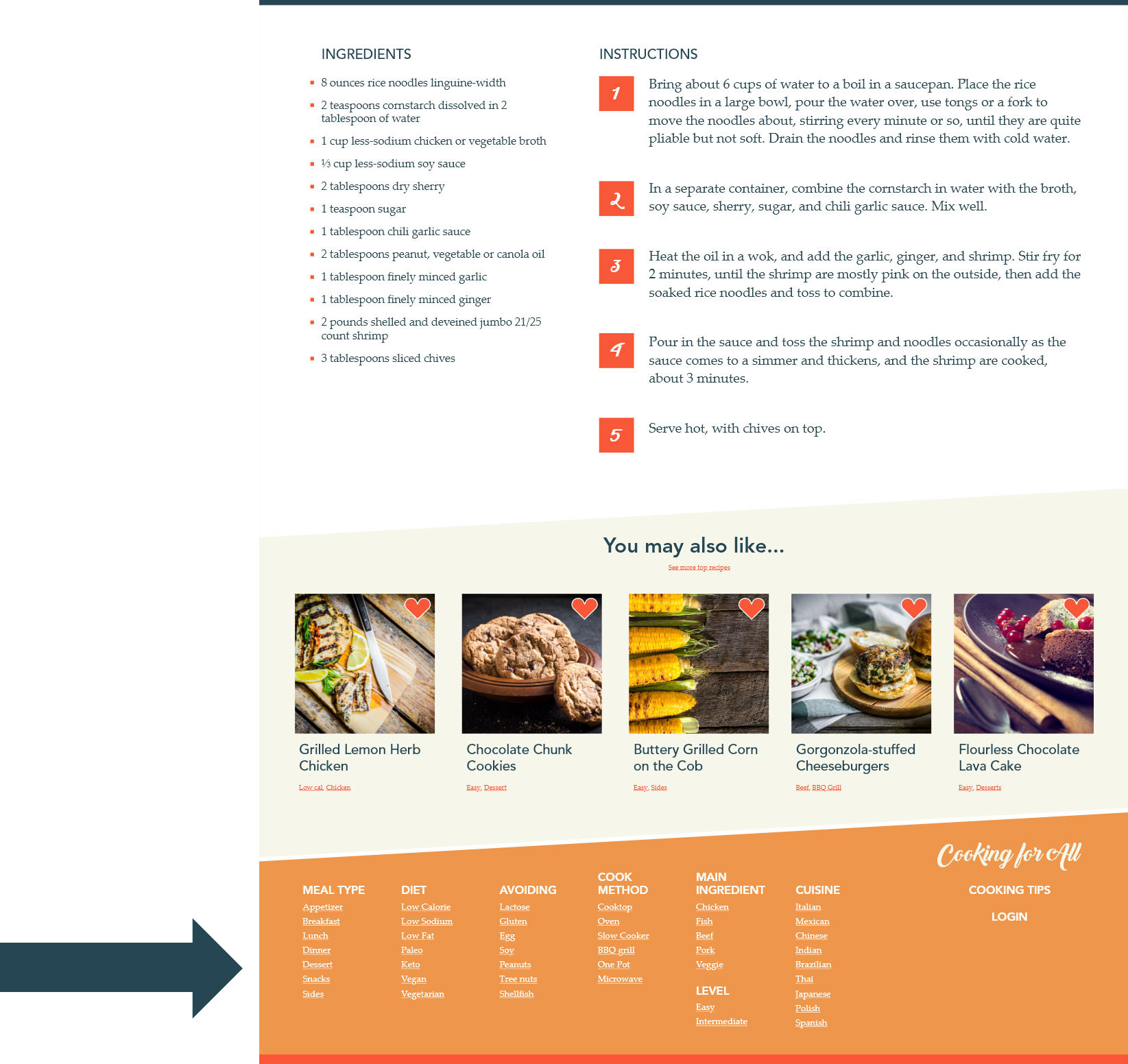
In the wireframe of the recipe page, following the feedback from the usability study, the ingredients and the steps are listed side by side so they can be easily referred to while cooking.
In the wireframe of the recipe page, following the feedback from the usability study, the ingredients and the steps are listed side by side so they can be easily referred to while cooking.
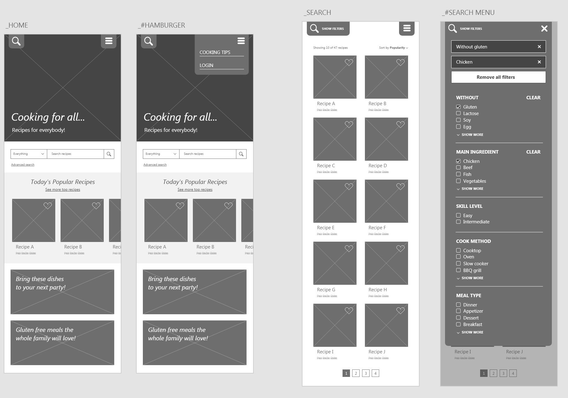
Digital Wireframes: Mobile
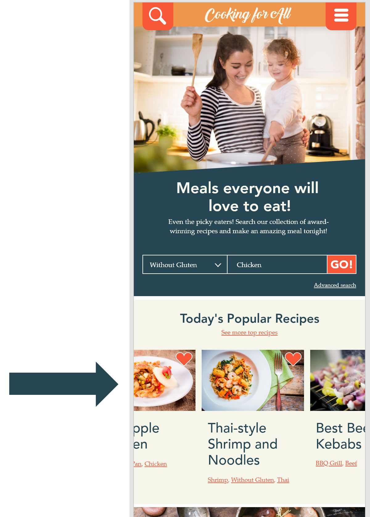
The robust search will still be present in the mobile version, however it will be in a flyout menu.
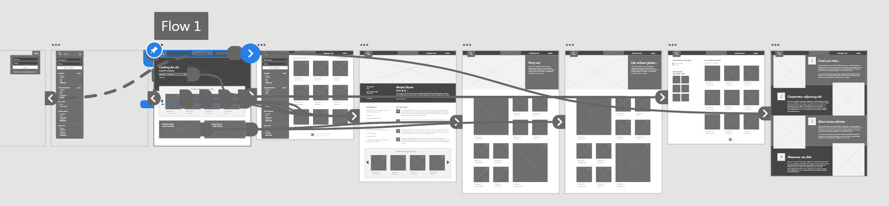
Low Fidelity Prototype
In the low fidelity prototype I highlighted the flow in which a user could use the robust search engine to find a recipe, or instead to view a categorical page and choose a recipe from there, based on pictures.
- Sometimes it was not obvious that you could scroll through recipes in the carousel.
- When you go from the search box on the main page to the search results, it would be helpful to see what you searched for.
- It would be nice to see all the possible categories and things that you could search for in one place.
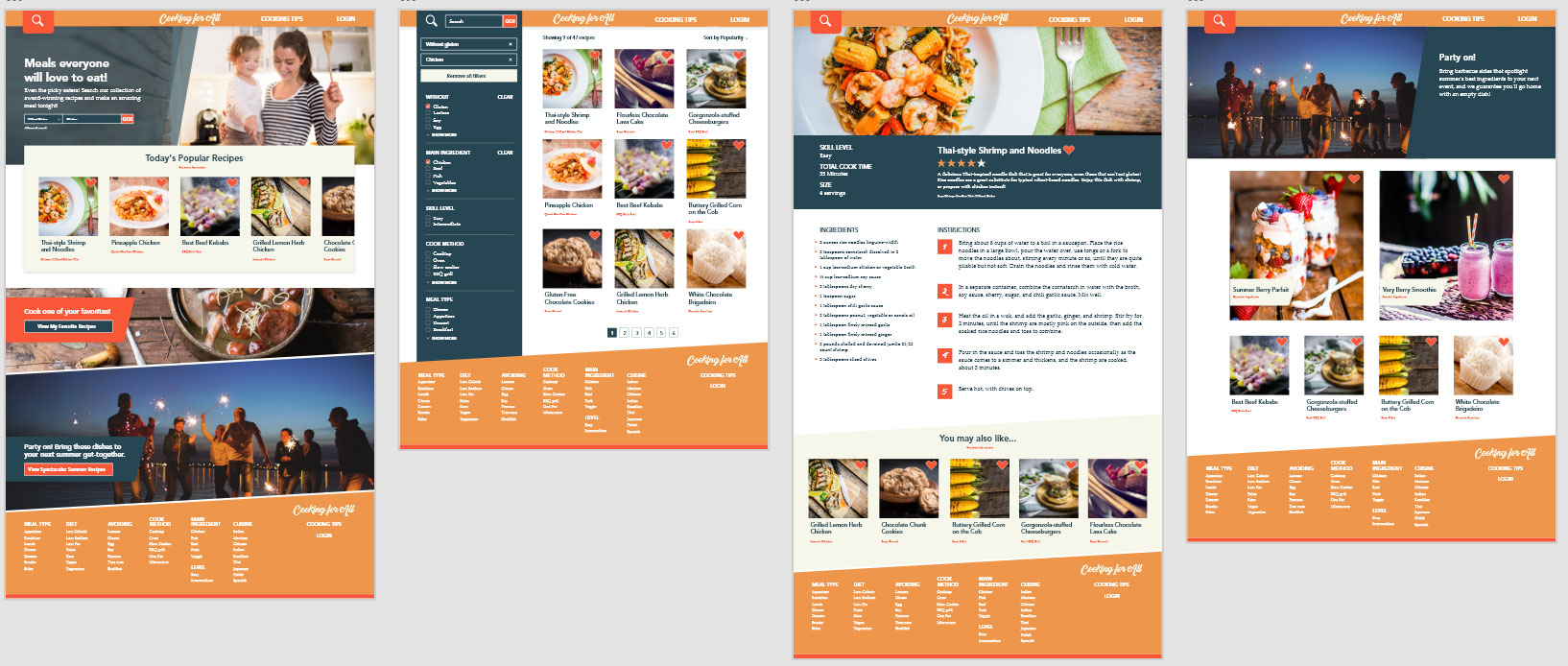
Mockup: Desktop
Based on user feedback, a footer was added after the low fidelity prototype stage, adding a list of many of the categories that could be searched.
Mockup: Mobile
Based on user feedback, changes were made to the carousel. Having the content be split on the left and right provides a visual cue to the user that there is more information that can be paged through.
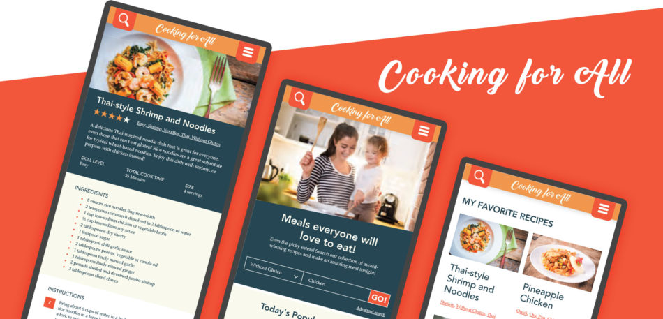
High Fidelity Prototypes